Radol'ca, Honestly Sweet
The destination brand name 'Radol'ca Honestly Sweet' was established at the start of 2011. The project to plan Radovljica's destination brand name was led by the Radovljica Public Institute for Tourism, whilst it was designed and executed by the Memo Institut agency.
 The creation of Radovljica's tourist story took place systematically. The process of designing the brand name began with research into how tourists view the Municipality of Radovljica today, and an analysis of the products and services in the municipality that are attractive to tourists. The purpose of the research was to identify the potential of the destination's interesting and competitive advantages. The results then served as a basis for the creation of the Radovljica brand name.
The general strategic focus of Slovenian tourism is the accelerated development of sustainable tourism products. This focus is the answer to the perceived global trends of growth in green tourism. The research showed that the Municipality of Radovljica should rightly move towards being a sustainable destination. With its boutique and authentic range of tourist products, Radovljica already personifies the essence of a sustainable destination; a mix of nature, tradition and health.
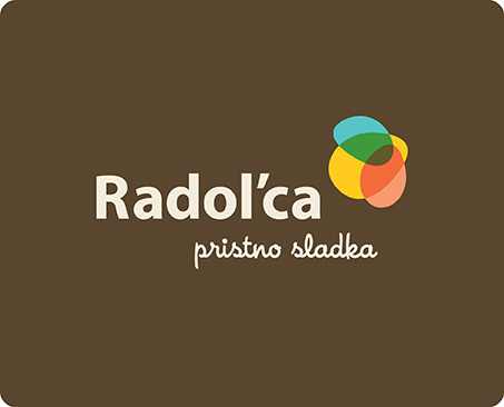
The tourist brand name of the Municipality of Radovljica therefore wishes to conjure up the charm of the countryside, where the link between nature and man is still preserved today. There is an exceptionally rich tradition of beekeeping in the countryside – the link between nature and man is most sincerely and sensitively personified by bees. The new logo, representing a small bee, has been drawn deliberately in a more abstract style. It is a play of various coloured ellipses, forming the wings and body, depicting the diversity of the area: culture and nature, tradition and modernity and, most importantly, the town of Radovljica and its surroundings. The Radol'ca brand name, therefore, has been designed to equally represent Radovljica as well as its surroundings – numerous villages and hamlets which are, proverbially, bursting with creativity. The chosen name 'Radol'ca' (as locals in Radovljica and occasionally also elsewhere call it) is intentionally different to the geographic name Radovljica, in order that, in the long-term, the brand name will become a synonym for the whole area.
With the chosen palette of colours, the entire graphic reflects the content and values which are the foundation of the strategy of Tourism Radovljica; blue (rivers, mountains, air, freedom), green (nature, ecology), red (the colour of the coat-of-arms of the Municipality of Radovljica), warm yellow (sweetness, joy, vigour), and brown (authenticity and the countryside). The slogan 'Honestly Sweet' rounds-off the sustainable story of the destination brand name. Radol'ca is 'Honestly Sweet' because it is pleasant and inviting. Radol'ca is 'Honestly Sweet' because it is authentic, cute, boutique and hospitable.
The vision of the Radol'ca brand is to become recognised as a sustainable destination of numerous sweet discoveries and small sweet treats.


